Branding and website design for Life Source

I worked closely with Life Source Consultants to develop a new visual identity that positions their organization as a trusted space and safe haven for those seeking refuge.
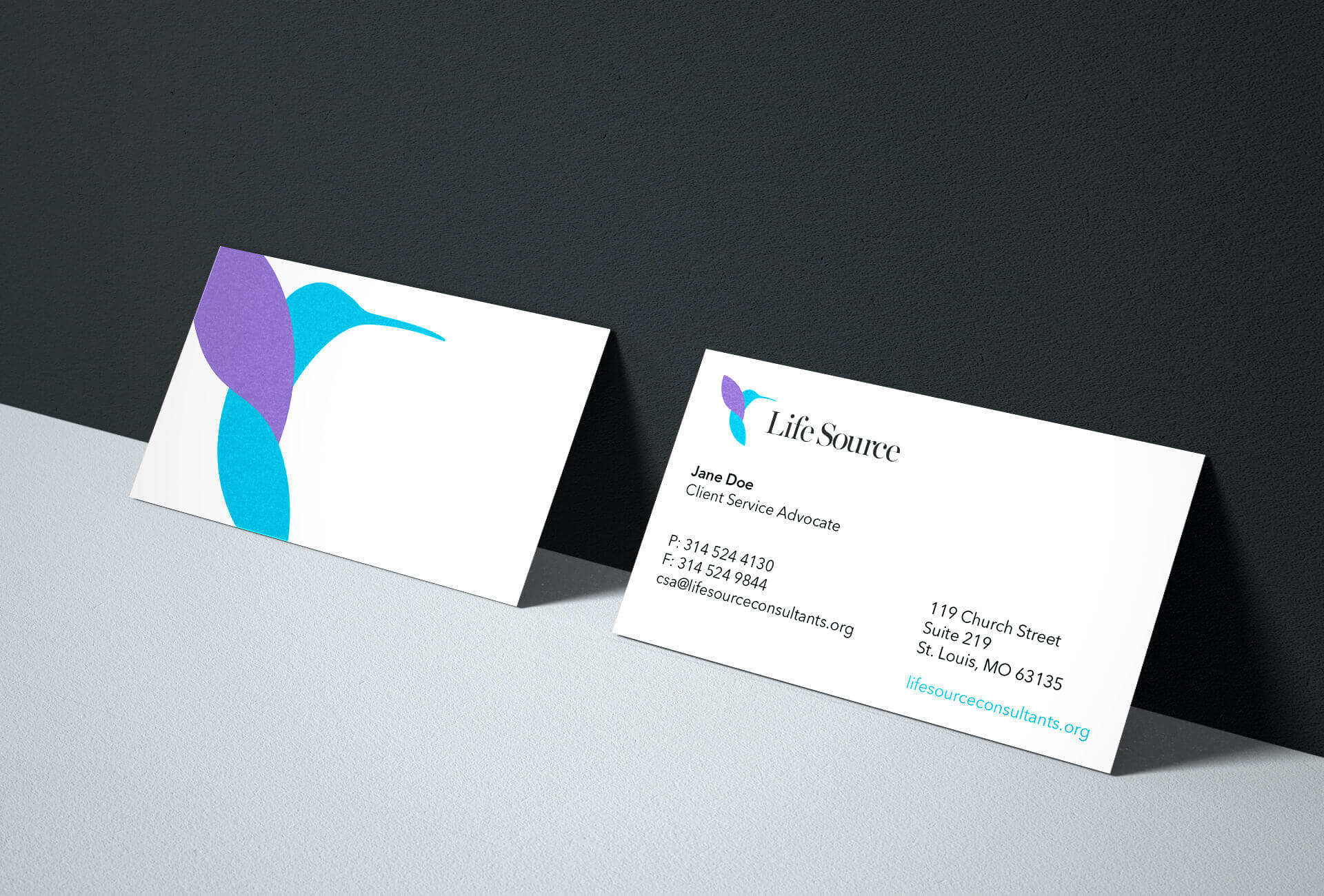
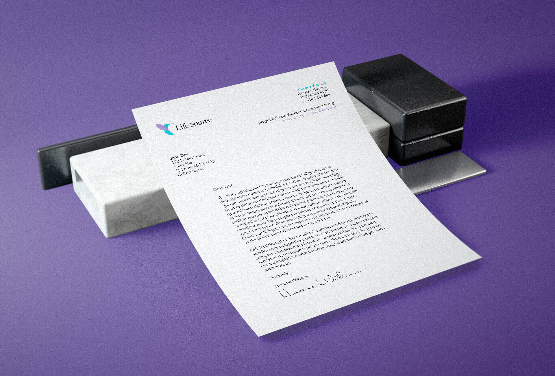
Brand Identity
Life Source is a relatively small nonprofit organization yet it's capable of big feats. With that in mind, I wanted to create an identity that symbolized those qualities. After extensive research, I realized that Life Source is much like a hummingbird. The hummingbird is tiny, but it possesses qualities that no other birds are capable of, such as its awesome speed and agility. Hummingbirds also symbolize healing, resiliency, and the lifting of negativity.
Typeface and Brand Colors
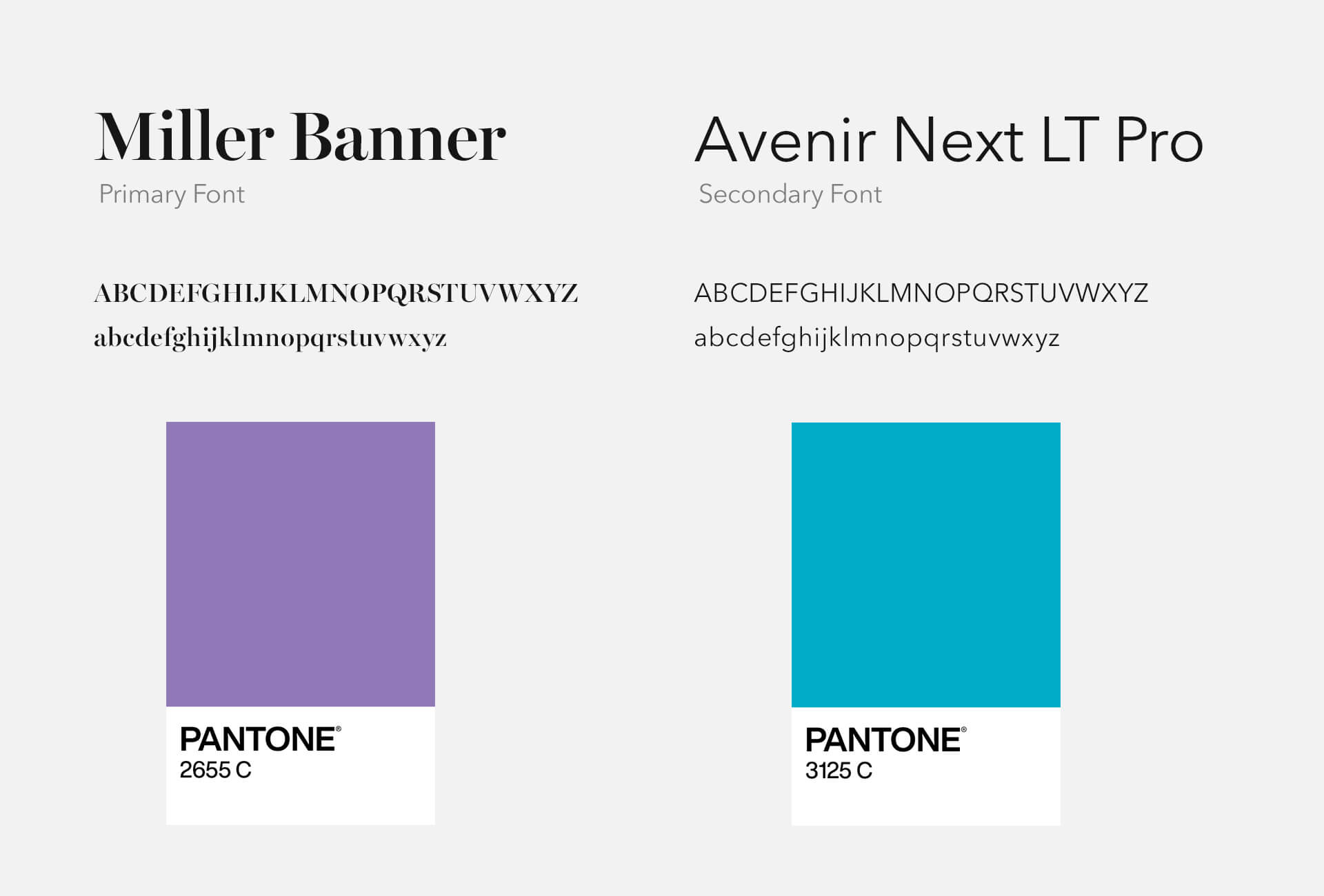
The primary typeface chosen was Carter & Cone's Miller Banner, with Linotype’s Avenir Next LT Pro used
as the secondary typeface throughout.
During the research process, I learned that the ribbon colors for domestic violence and sexual assault
awareness months were purple and teal, respectively. So, it made sense to make those the brand colors to
further emphasize its dedication to victims.
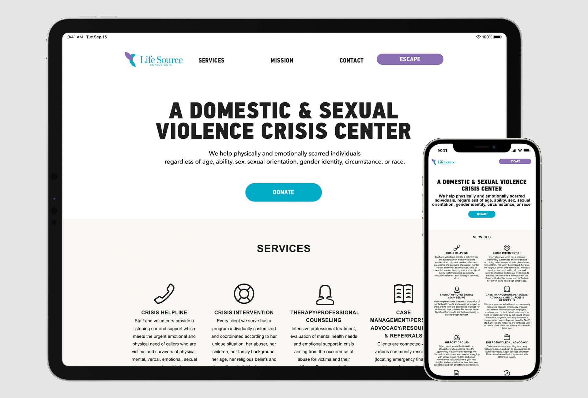
Website Redesign & Development
Small nonprofits' marketing budgets are often constrained, but I wanted Life Source to have an end-to-end transformation and a proper digital presence. The previous website was not helpful for potential clients to get the information they desperately needed. I designed and developed a straightforward website that was easy to digest and features an "escape" button for victims to press to quickly link to Google's homepage. Visit site.